
Explore The Senses

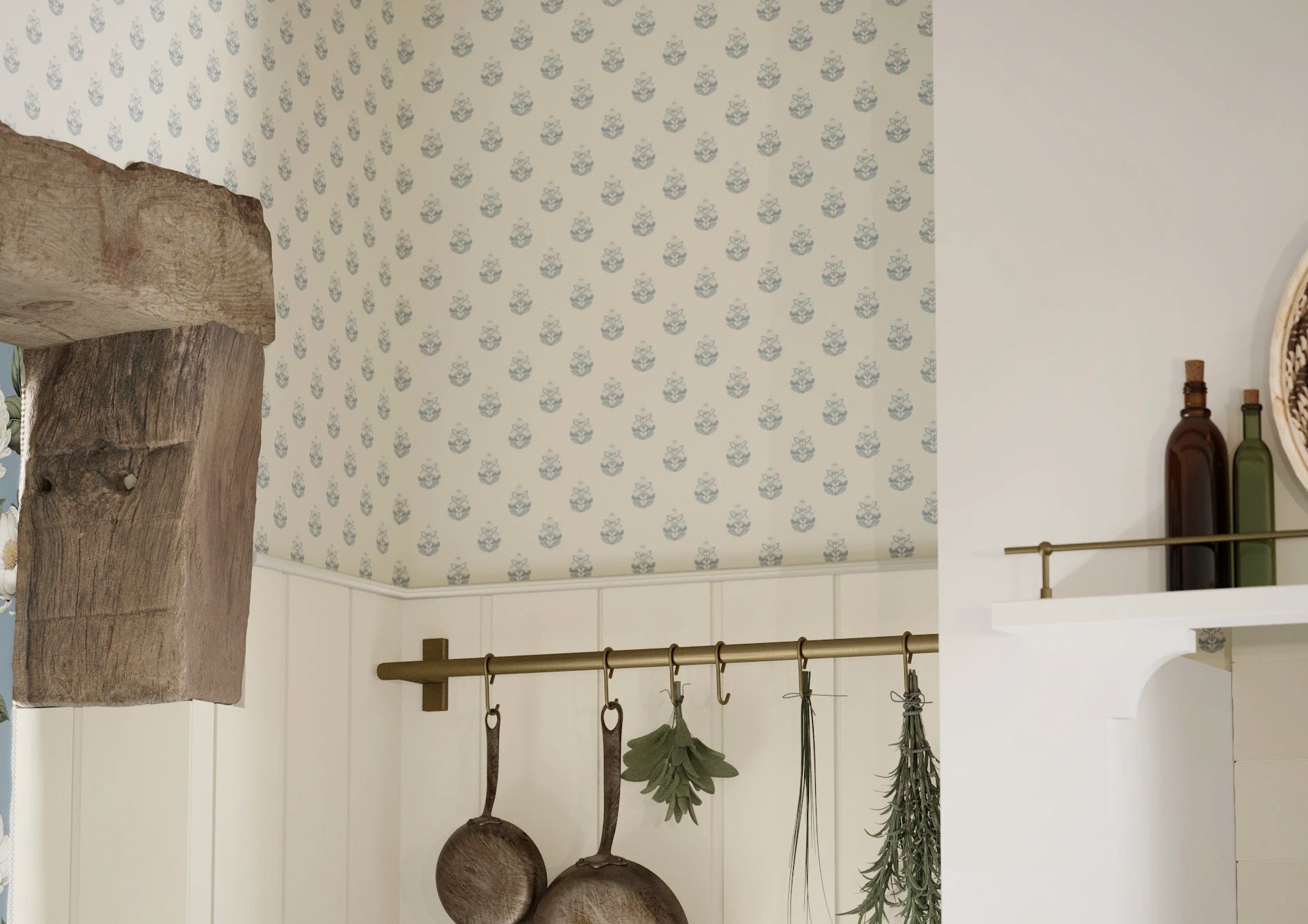
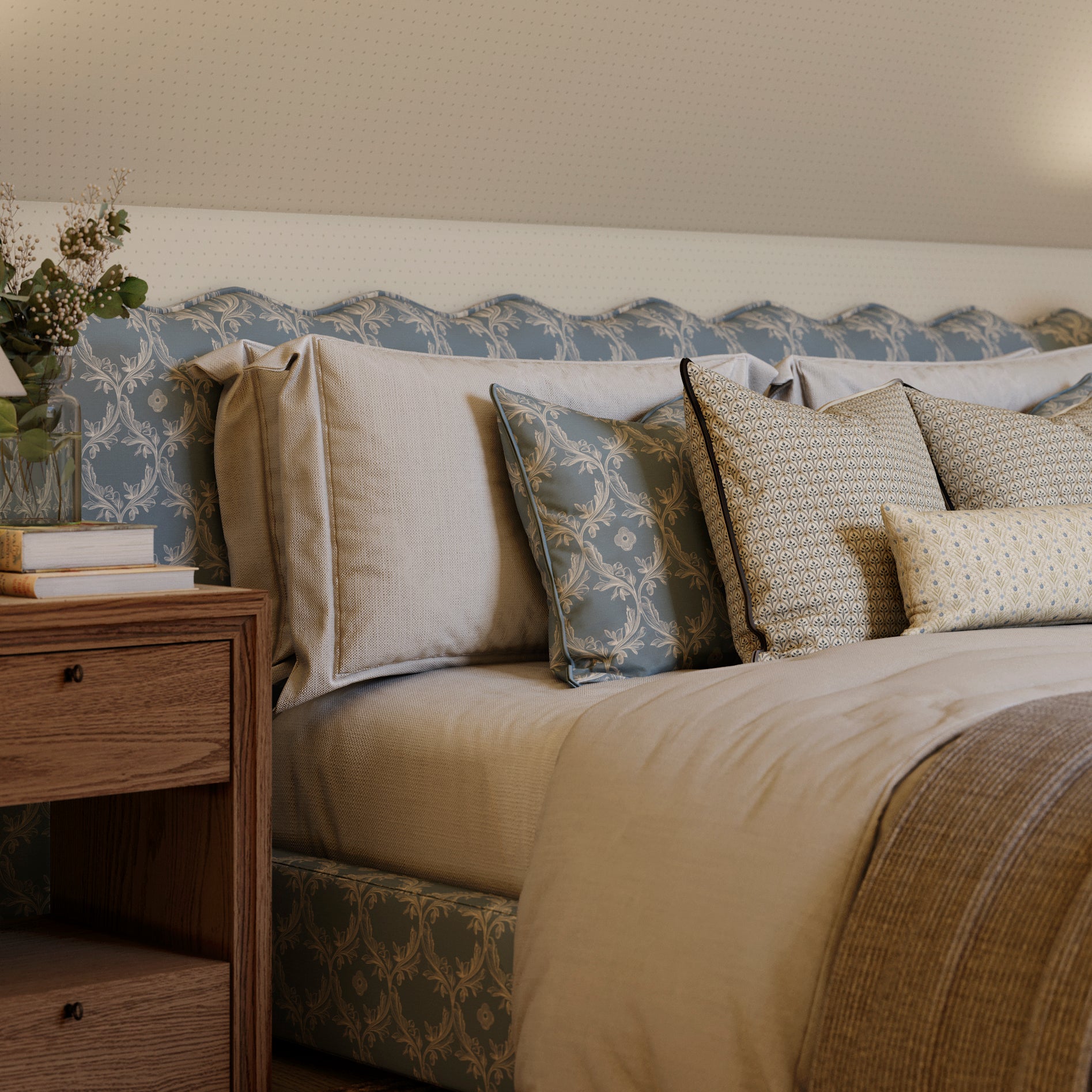
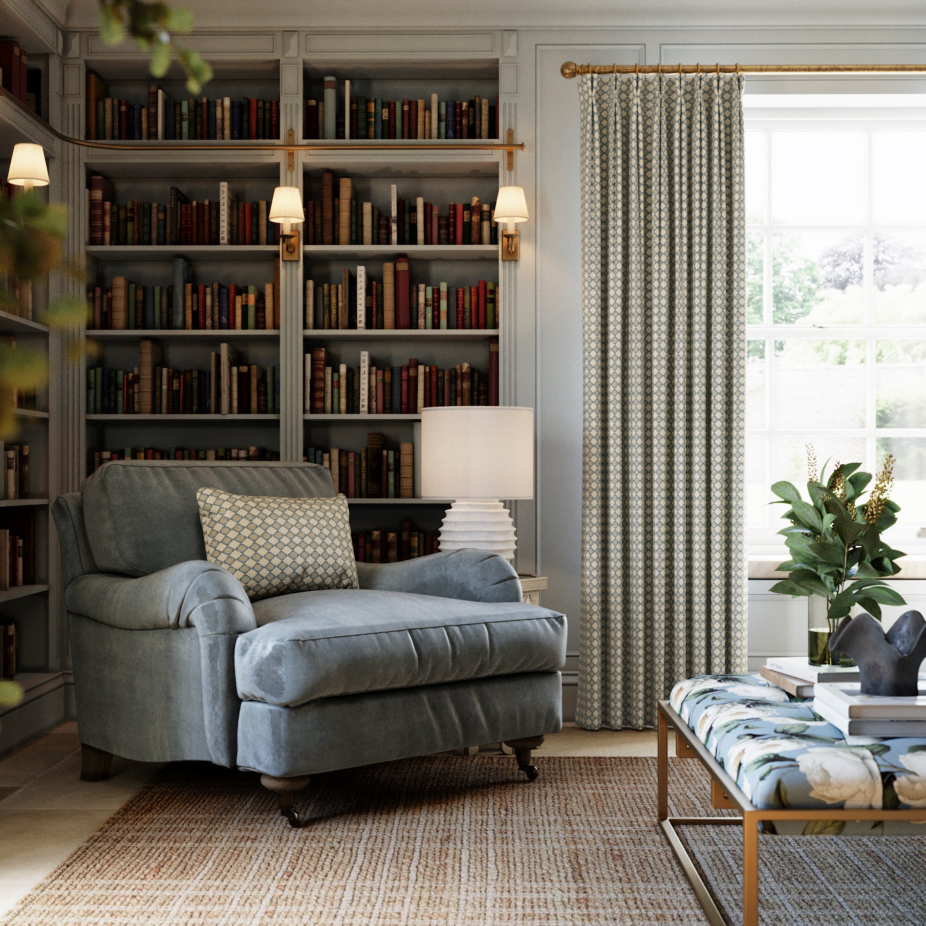
Serene
The Serene palette is soft and grounded, inspired by nature’s most restful moments: sea-worn stones, linen skies, and quiet garden blooms. The result is a collection full of softness, subtlety, and soul. Serene is our invitation to live beautifully, comfortably and just a little more playfully.

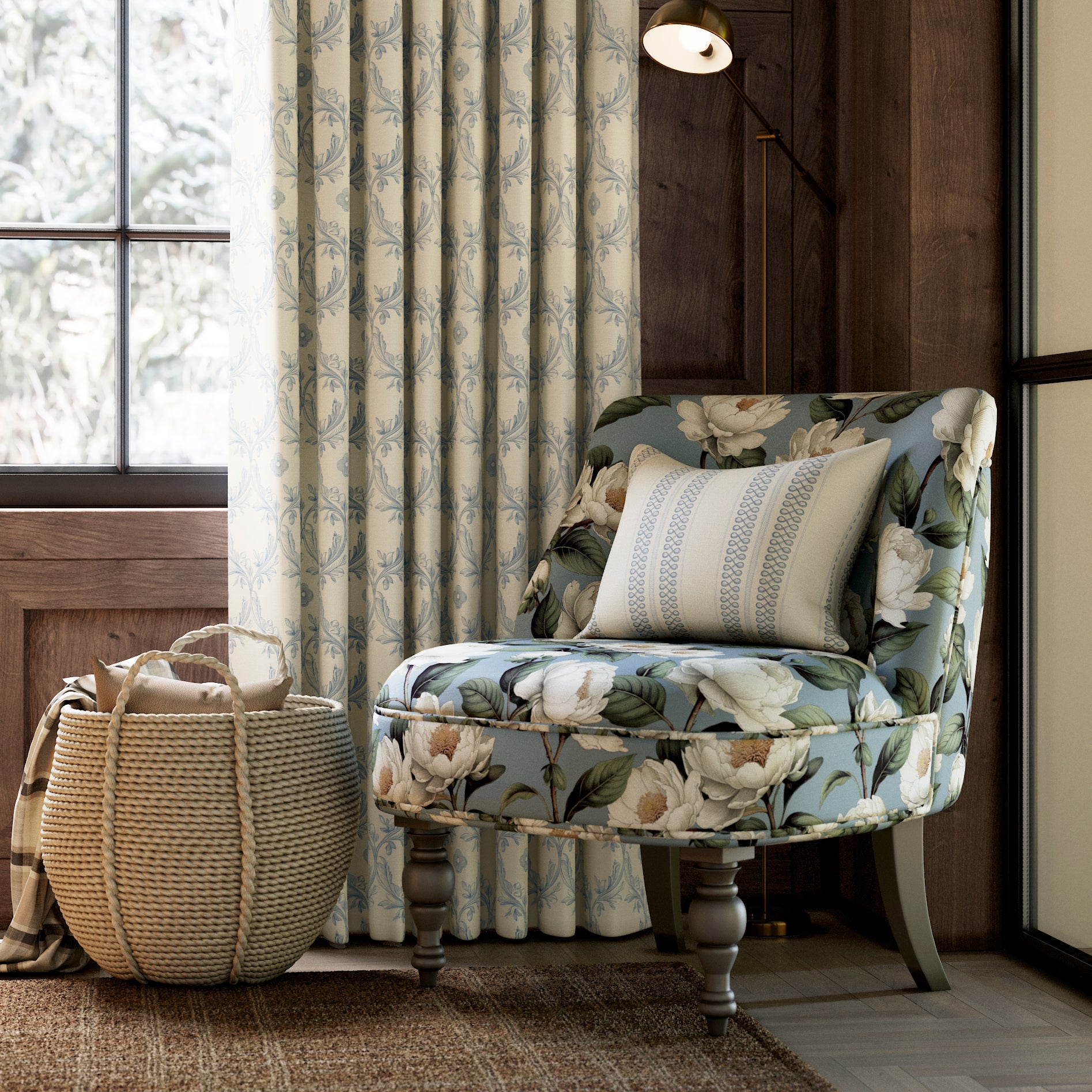
Refined
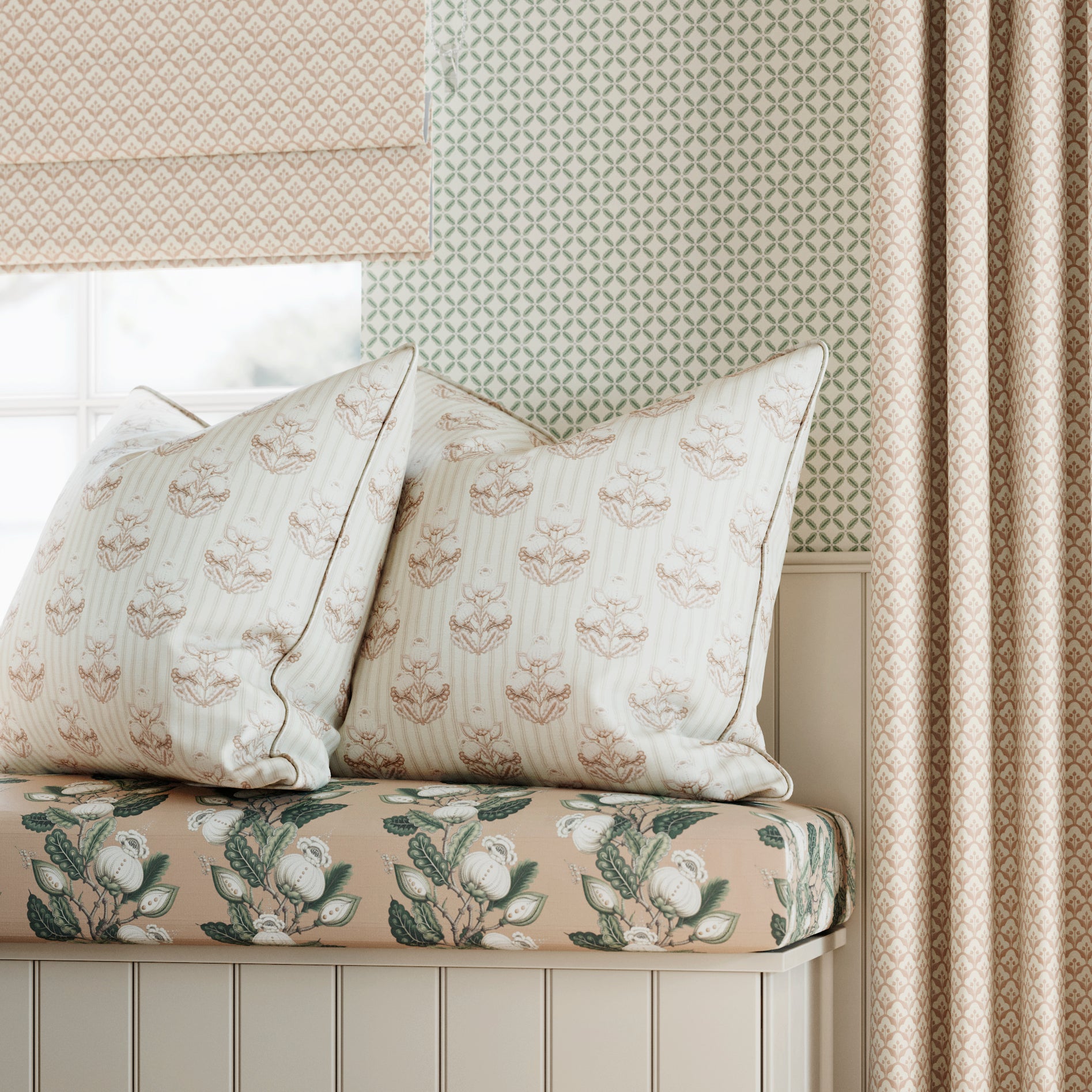
The Refined palette is warm and enveloping, drawn from the rich depth of autumn’s embrace: burnished woods, spiced earth, and the glow of firelight. These tones create a sense of comfort and sophistication — a cocooning backdrop that feels both timeless and welcoming. Refined is our invitation to slow down, savour the season, and dwell in warmth and elegance.

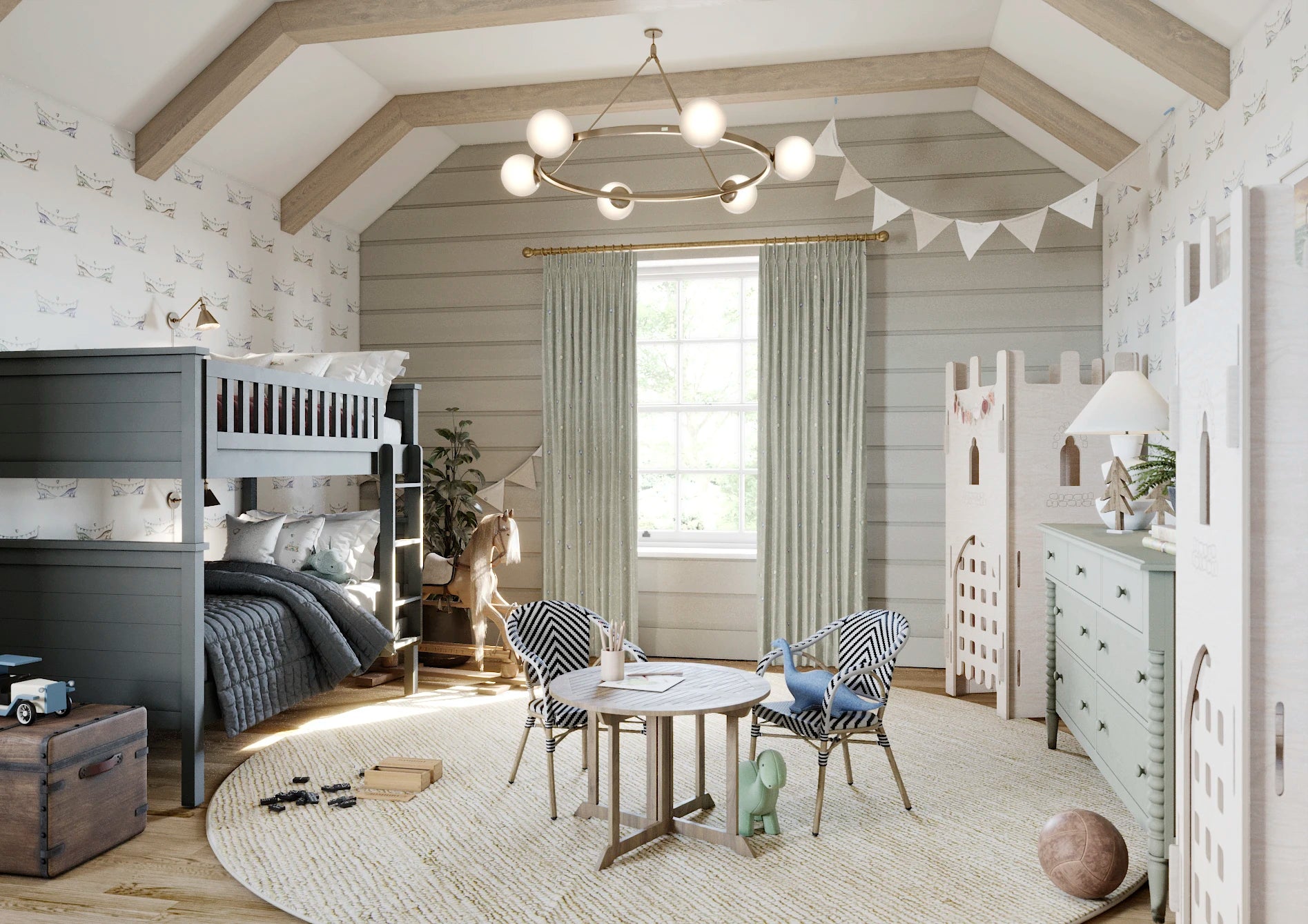
Joyful
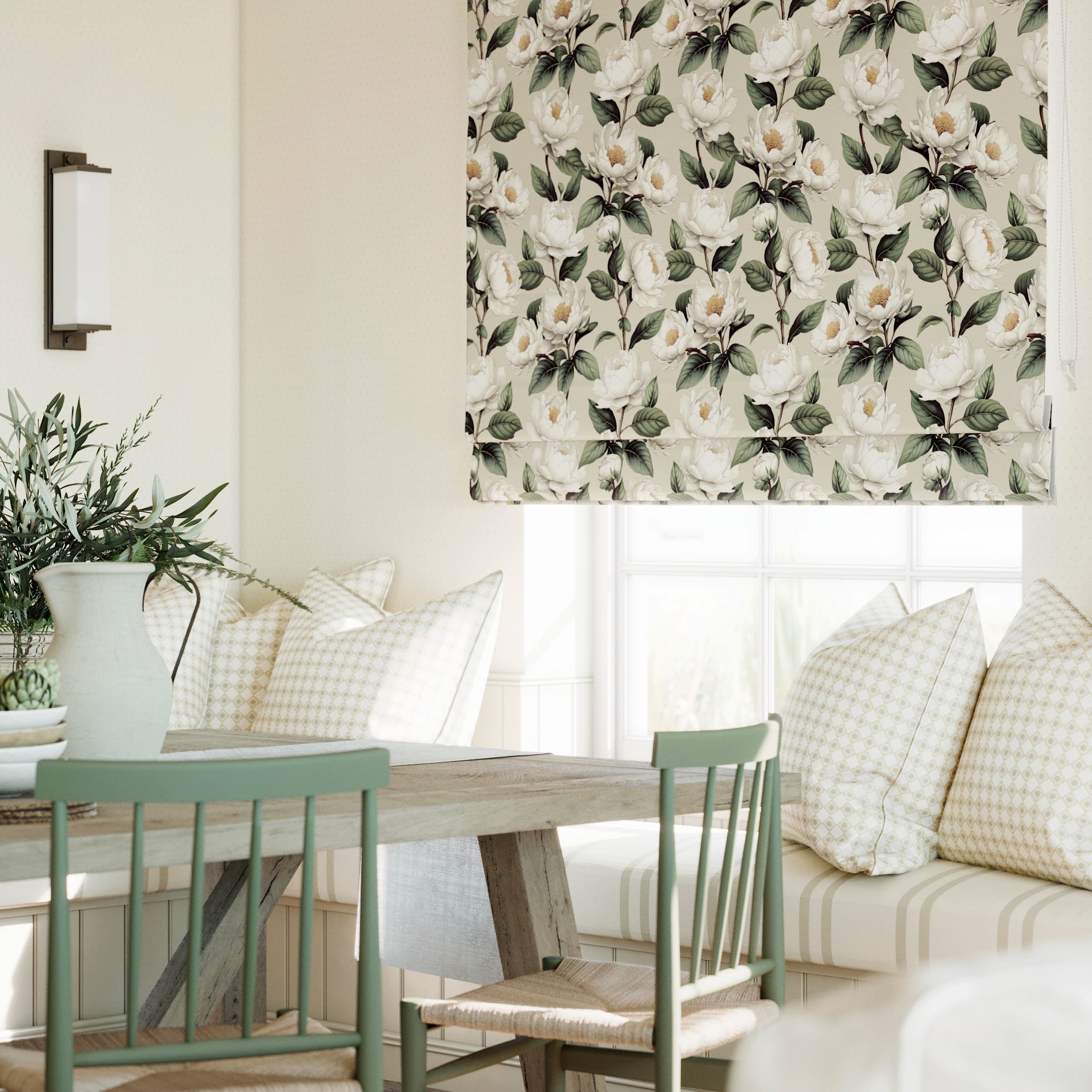
The Joyful palette is spirited and uplifting, alive with bright floral tones and balanced by timeless heritage neutrals. Think poppies in full bloom, sunlit courtyards, and colours that dance together with warmth and charm. The result is a collection that brims with energy, optimism, and character. Joyful is our invitation to embrace colour with confidence and celebrate life at home.
A Rather Clever Way to Mix and Match
At the House of Abigail, we believe decorating should be a delight - not a daunting task. That’s why we’ve created our Colour Sense System, a smart little method for ensuring all our prints play nicely together. Each design is coloured to sit within one of our carefully curated palettes (we call them Senses), so you can mix stripes with florals, or vines with geometrics, without the fear of a clash. Pattern play, made pleasingly simple.
Abigail’s Done the Hard Work
Think of Abigail as your designer-in-residence - she’s already done the clever part, so you can get on with the fun bit. Each Colour Sense - be it Serene, Refined, or Joyful - is a ready-made world of harmonious hues, where everything’s designed to work beautifully together. No stress, no swatch fatigue - just simple, satisfying scheming for homes with heart.
A Little Sense and Style-ability
We’re not here to sell you paint - we’d much rather you choose the right product for the job. That said, we make colour matching as easy as a Sunday afternoon. All our samples include printed colour swatches, so you can match your paints with confidence. And with our clever Pattern Palette on every product page, you can mix, match and scheme up your own look - with all the sense-checking built in.
Beautifully Balanced, Effortlessly You
Whether you're reimagining a country kitchen or adding charm to a city flat, our Colour Sense System gives you the confidence to be creative. It’s all about easy elegance, layered pattern, and homes full of personality. The result? Spaces that feel every bit as unique, joyful, and charming as you are.